
The color combinations that change how you feel at home
In summary
Calm comes from low contrast and natural tones
Intimacy comes from depth and controlled contrast
Warmth comes from consistent temperature
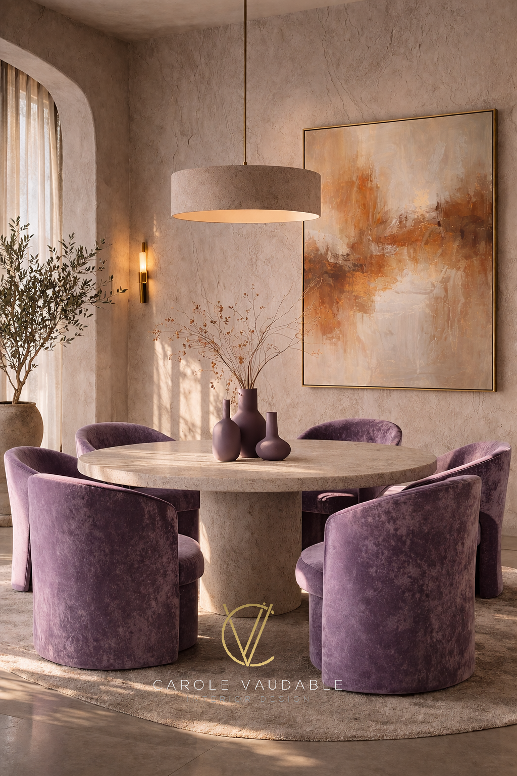
Dining Room proposal designed by Carole Vaudable Interior Design.
Most people think color is a style decision. It’s not. Color is one of the fastest ways your brain decides if a space feels safe, calm, inviting or uncomfortable. This happens in seconds, before you even notice the furniture.
I see this all the time. People focus on sofas, lighting, layouts. But the reason a room feels “off” is often the color combination.
In the three parts below, I break down three emotional states every home should get right: calm, intimate and warm.
Calm is about reducing stimulation
Your nervous system is constantly scanning your environment. When colors are too strong or too contrasted, your brain stays alert.
Calming spaces do the opposite. They reduce visual noise.
That is why the most calming color combinations are soft, close to each other and slightly desaturated.
Examples:
Sage green + warm white
Dusty blue + soft beige
Olive green + cream
Pale peach + warm gray
Lavender + stone
Muted teal + sand
Soft brown + ivory
Eucalyptus green + light wood
These colors are often found in nature; your brain recognizes them as familiar and safe. Studies in environmental psychology show that natural tones lower stress and help the body relax.
This is what I show in this video.
If your home feels overwhelming, this is usually the first thing I adjust.
2. Intimacy is about contrast and depth
A space feels intimate when it creates a sense of closeness. This comes from depth, not from brightness.
When you combine slightly darker tones with softer ones, the room feels more grounded: your eye slows down and you feel more present.
Examples:
Dusty rose + dark brown
Terracotta + blush
Burgundy + pale pink
Plum + beige
Olive green + warm cream
Rust + muted lilac
Forest green + walnut
Chocolate brown + ivory
These combinations create a subtle tension between light and dark. This is what makes a room feel personal instead of flat.
Research shows that lower light levels and deeper tones increase feelings of comfort and emotional connection. This is why restaurants, hotels and private spaces use them.
I break this down here.
If your space feels cold or impersonal, this is usually the missing layer.
3. Warmth is about temperature, not color names
Warmth is not about adding “warm colors” randomly, like red and orange. It’s about creating a consistent temperature in the space.
When colors clash in temperature, the room feels disconnected. When they align, the space feels cohesive and inviting.
Examples:
Terracotta + cream
Camel + ivory
Rust + sand
Honey wood + off white
Clay + blush
Caramel + taupe
Ochre + warm gray
Burnt orange + beige
Cinnamon brown + soft pink
Golden beige + warm white
Warm tones are associated with comfort, shelter and social connection. This is supported by studies showing that warm environments increase feelings of trust and relaxation.
If your home feels empty it often needs more warmth.
To have your home designed by me, get on the list below.
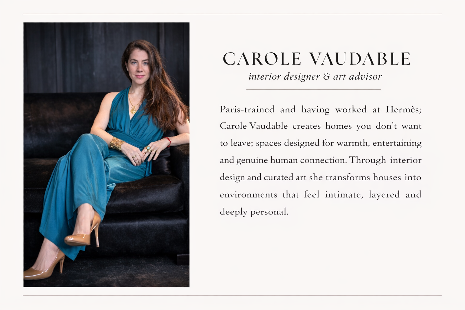
Written by Carole Vaudable, interior designer.

A space feels intimate when it creates a sense of closeness. This comes from depth, not from brightness.
When you combine slightly darker tones with softer ones, the room feels more grounded: your eye slows down and you feel more present.